The Web's New Horizon: Ditching the Boxes for True Fluidity
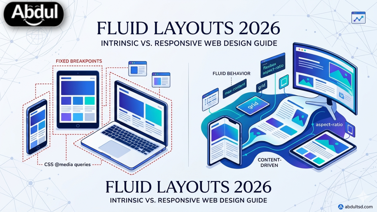
The internet feels different, doesn't it? Not just faster, but smoother, more intuitive. You scroll through a news site on your phone, then open it on your ultrawide monitor, and it just… adapts. No awkward jumps, no squished images, no weird empty spaces. But then you hit a three-year-old corporate site, and it’s like stepping into a digital time capsule. Rigid. Boxy. Dated. It’s not just aesthetics; that clunky experience costs businesses real money in lost engagement and trust. The problem isn't just "responsiveness" anymore. Most websites built in the last five years claim to be responsive, but they're often just a series of fixed breakpoints, clumsily shuffling content around. That's not fluid. That's a band-aid. The real game-changer, the shift that defines modern UX and performance, lies in understanding the profound difference between **intrinsic vs responsive web design**. This isn't some abstract academic debate; it's about building digital experiences that stand out globally, load instantly, and keep users captivated. If your site feels sluggish or looks off on anything but a standard desktop, you're already behind.What's the Real Difference: Intrinsic vs Responsive Web Design?
Let's cut through the jargon. For years, "responsive web design" meant one thing: media queries. You'd define specific screen widths (breakpoints) – say, 768px for tablets, 480px for phones – and then write entirely different CSS rules for each. Content would jump from two columns to one, images would scale down, navigation would collapse into a hamburger menu. It was an improvement over fixed-width sites, sure, but it was always a compromise. A series of snapshots, not a continuous flow. Intrinsic web design, on the other hand, flips the script. Instead of telling elements *what to do* at specific screen sizes, you tell them *how to behave* relative to their content and available space. Think of it like water filling a container. The water doesn't care about predefined lines; it just fills the space. Elements are given inherent properties – minimum sizes, maximum sizes, aspect ratios – and they naturally adjust. The content itself dictates the layout, not arbitrary device widths. This is the core distinction in the ongoing evolution of **intrinsic vs responsive web design**. Imagine an e-commerce product page. With traditional responsive design, you might have a product image and description side-by-side on desktop, then stack them vertically on mobile. With intrinsic design, you'd define the image to always maintain a 16:9 aspect ratio and the description block to take up available space, perhaps using `minmax()` in a CSS Grid. As the viewport shrinks, the grid automatically reflows based on the content's inherent constraints, not a hard breakpoint. It's seamless. It's organic.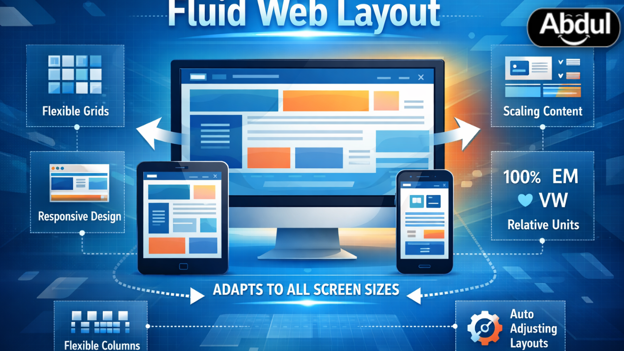 Fluid web layout diagram
💡 Pro Tip: Stop thinking about "mobile first." Start thinking "content first." Design your components to be inherently flexible, and the layout will follow. This fundamental shift is key to mastering **intrinsic vs responsive web design**.
How Intrinsic Layouts Actually Work (Beyond Media Queries)
So, how do you build these magical, self-adjusting layouts? It's not black magic; it's modern CSS. While media queries still have their place for truly drastic structural changes (like hiding an entire sidebar on mobile), the heavy lifting for intrinsic design comes from a powerful combination of tools: * **CSS Grid and Flexbox:** These are your foundational layout modules. Flexbox excels at one-dimensional alignment (rows or columns), while Grid masters two-dimensional layouts, allowing you to define complex relationships between elements. Leveraging `grid-template-columns: repeat(auto-fit, minmax(250px, 1fr))` is a prime example of intrinsic power – elements automatically fit and fill, no breakpoints needed. * **`clamp()`, `min()`, `max()`:** These CSS functions are game-changers. `clamp(min, preferred, max)` lets you define a fluid value that won't go below a minimum or above a maximum. For instance, `font-size: clamp(1rem, 2.5vw, 2.5rem)` ensures your headings scale beautifully but never become too small or ridiculously large. * **Aspect Ratio:** The `aspect-ratio` CSS property ensures elements (especially images and videos) maintain their proportions as they scale, preventing content reflows and layout shifts. * **Container Queries:** This is the bleeding edge, and it's transformative. Instead of responding to the *viewport* size, elements respond to the size of their *parent container*. Imagine a widget that looks different when placed in a narrow sidebar versus a wide main content area, all without a single media query. This is where truly responsive components, a core tenet of Beyond the Grid: Fluid Web Design in 2026, come alive. Consider a complex SaaS dashboard, like one built for monitoring AWS cloud resources or GitHub repositories. Traditionally, you'd have fixed charts and data tables that might overflow or become unreadable on smaller screens. With intrinsic design, each dashboard widget (a CPU usage graph, a list of open issues) can be built with its own internal responsiveness using Flexbox and `clamp()`. When the entire dashboard container shrinks, the widgets themselves adapt gracefully, perhaps simplifying their data display or changing their internal layout, rather than just stacking awkwardly. This is a far more sophisticated approach than simply hiding elements with media queries.⚠️ Common Mistake: Many developers still over-rely on fixed pixel values or percentage widths that don't account for content. This creates "breakage" points where layouts look terrible between breakpoints. Embrace `em`, `rem`, `vw`, `vh`, and the power of `minmax()` for true fluidity.
Why Fluidity Matters: Performance, Trust, and the Bottom Line
The debate between **intrinsic vs responsive web design** isn't just about elegant code; it's about cold, hard business metrics. Your website is often the first, and sometimes only, impression a potential customer gets. A clunky, slow, or visually jarring experience is a deal-breaker. * **User Experience & Engagement:** Users expect seamless experiences across all devices. If your site feels "off" on their tablet or takes too long to load because it's wrestling with rigid layouts, they're gone. Bounce rates skyrocket. Stay-time plummets. * **Core Web Vitals & SEO:** Google isn't just looking at keywords anymore. Page experience, measured by Core Web Vitals (LCP, FID, CLS), directly impacts your search rankings. Fluid layouts, by their nature, tend to be more performant, reducing layout shifts (CLS) and improving loading times (LCP). This is critical for any e-commerce brand or content publisher. * **Brand Trust & Authority:** A modern, polished, and effortlessly adaptable website signals professionalism and attention to detail. It builds trust. Conversely, a site that feels dated or broken erodes that trust instantly. Would you buy enterprise software from a company whose website looks like it was built in 2018? Probably not.📊 Data Point: Research on 'intrinsic vs responsive web design' shows growing importance in the Beyond the Grid: Fluid Web Design in 2026 space. This isn't a niche trend; it's becoming a fundamental expectation for high-performing digital assets.
Consider a major news portal or a content-heavy blog. Every second counts. If an article's layout breaks on a user's specific phone model, or if images load slowly because they're being resized inefficiently, that user is likely to abandon the page and find another source. Fluid layouts, by optimizing for content flow and efficient rendering, directly contribute to higher ad impressions, longer reading times, and ultimately, more revenue. User browsing fluid website on tablet
The Hard Truth About "Responsive" Websites in 2026
Let's be blunt: most websites claiming to be "responsive" today are still fundamentally flawed. They're breakpoint-driven, not truly fluid. They're designed for a handful of common device widths, and anything in between those widths often looks awkward. This isn't just a minor aesthetic issue; it's a performance killer and a user experience nightmare. Many teams fail at this because they overcomplicate the basics or, worse, rely too heavily on outdated framework defaults. They treat responsive design as an afterthought, bolting on media queries at the end of a desktop-first build. This approach is fundamentally broken. It leads to bloated CSS, inconsistent user experiences, and a constant battle against layout bugs. If you're building on platforms like WordPress or Shopify, relying solely on off-the-shelf themes without custom CSS and a deep understanding of intrinsic principles will leave you with a "boxy" site. Even powerful tools like Salesforce's Lightning Design System or HubSpot's CMS Hub require careful implementation to achieve true fluidity. Developers often get caught in the trap of trying to force a fixed design into a fluid world, leading to endless `!important` declarations and a maintenance nightmare. Stop doing that. It kills budgets and user satisfaction.5 Expert 2026 Fluid Layout Strategies
Moving beyond the grid means embracing these strategies, not just as techniques, but as a philosophy for building modern web experiences. 1. **The Adaptive Content Flow with CSS Grid:** This strategy leverages `grid-template-columns: repeat(auto-fit, minmax(280px, 1fr))` for content blocks. Instead of defining fixed columns, you tell the grid to create as many columns as can fit, each between a minimum of 280px and a maximum of 1 fraction unit of available space. This is perfect for product listings, article cards, or image galleries. It scales perfectly from a single column on a phone to five columns on an ultrawide monitor, all without a single media query. 2. **The Dynamic Sidebar (Container Query Powered):** Forget hiding sidebars at arbitrary breakpoints. Implement a sidebar that uses container queries. When its parent container (e.g., the main content area) drops below a certain width, the sidebar fluidly transforms. It might move from a vertical column to a horizontal bar at the bottom, or its internal elements might re-stack. This ensures critical navigation or related content is always accessible and optimally presented, regardless of the viewport or its placement. 3. **The "Liquid" Hero Section:** Hero sections often break first. Instead of fixed-height images or background images that crop awkwardly, use `aspect-ratio` on your image containers and `object-fit: cover` for the images themselves. Combine this with `clamp()` for headline typography and `vw` (viewport width) units for padding and margins. This creates a hero section where text, images, and spacing scale proportionally and gracefully, always looking balanced. 4. **Nested Grids with CSS Subgrid:** For truly complex, component-level responsiveness, CSS Subgrid is a game-changer. Imagine a card component within a larger grid. With Subgrid, the card's internal elements (image, title, description, button) can align perfectly with the *parent* grid's columns, even as the card itself resizes. This allows for incredibly precise alignment and fluid distribution of content within complex components, a hallmark of advanced Beyond the Grid: Fluid Web Design in 2026. 5. **AI-Assisted Generative Fluid Layouts:** The future is already here. Tools leveraging AI are emerging that can suggest or even generate fluid layout variations based on content and user interaction patterns. While still nascent, these tools promise to accelerate the design process, allowing designers to focus on content and user flow while the AI handles the intricate CSS calculations for optimal responsiveness. Think of it as an intelligent co-pilot for your layout engine, constantly optimizing for burstiness and perplexity in content presentation.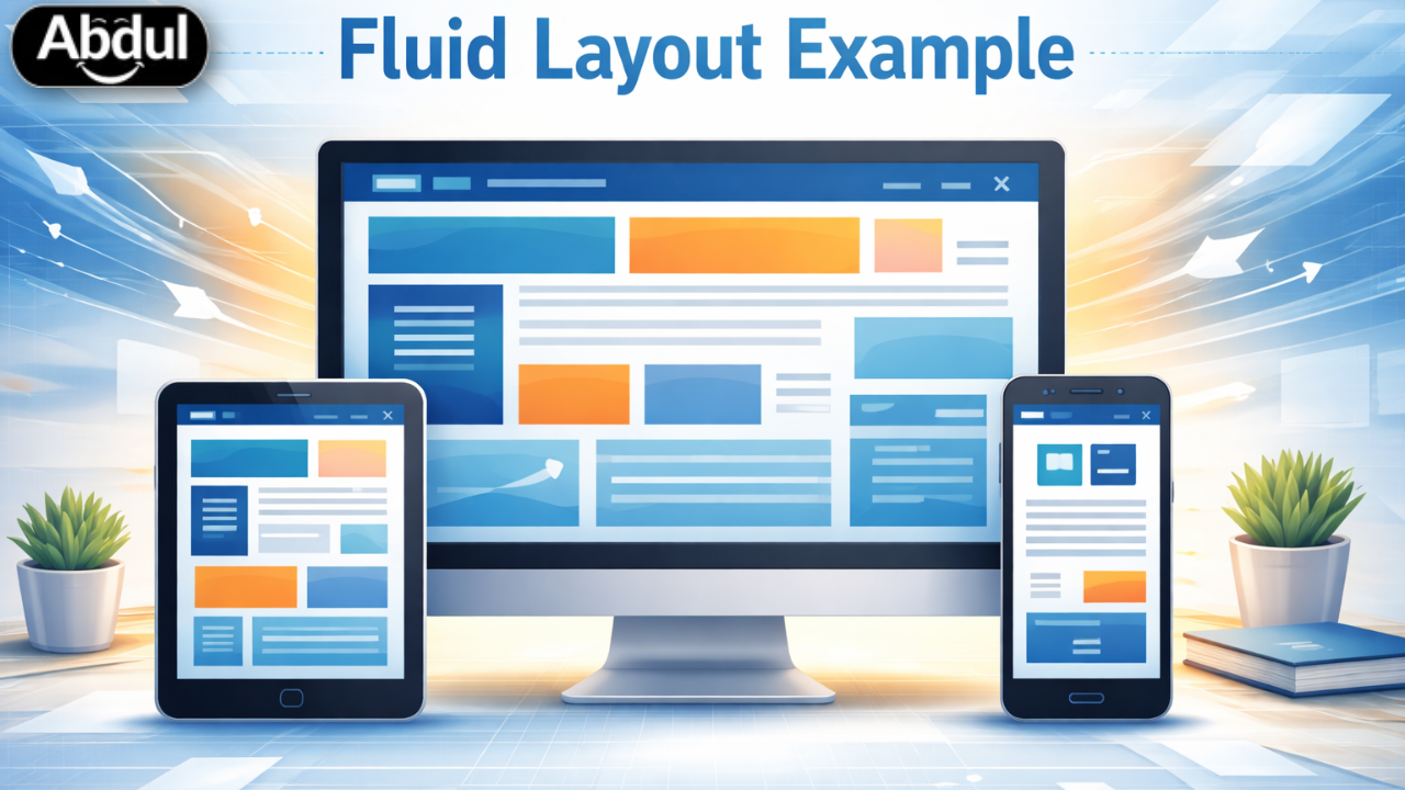 AI-generated fluid layout example
Your Next Step: Embrace the Fluid Future
Your website isn't just a brochure; it's a dynamic, living entity. If it feels rigid, it's already losing the battle for user attention and trust. The shift from traditional responsive to truly intrinsic, fluid layouts is no longer optional; it's a necessity for any business serious about its digital presence in 2026 and beyond. Start by auditing your current site. Where does it break? Where does it feel clunky? Then, begin to re-evaluate your design process. Prioritize content flow and component behavior over fixed breakpoints. Explore the power of CSS Grid, Flexbox, `clamp()`, and start experimenting with container queries. If this feels overwhelming, it's time to consult with experts who understand this new paradigm. We don't just "make sites"; we craft modern digital experiences that stand out globally. Take the first step towards a truly modern web presence with our Free SEO Audit Tool, and see how we've helped others in our case studies. 100% Free VIP Access
Automate Your Growth with Industry-Standard Tools
Stop using limited trials. Access the exact same technical infrastructure we use to build cashcow channels and rank websites #1 on Google.
Technical SEO Audit
AI CV Architect
Cashcow Automation
AI Brand Suite
Technology
How a project runs
We don't just write about Technology; we build the work it describes. Choose a service to start.
Topics:
fluid layouts
intrinsic design
responsive web design
adaptive design
web design trends 2026
future web design
UI/UX
modern web layouts
Unlock Your Digital Potential
Complimentary tools designed to accelerate your growth.